Some fun with Saxite, a logo, my first "font"
So Saxite is the new name for my siteware project. For those of you not paying attention, it’s all written in XSLT and XML and it runs on AxKit. I decided to make an icon so I came up with this icon, below.
Like it? I was inspired by a recent issue of Computer Arts Projects (one of the fantastic UK graphic design magazines that my local Indigo store carries) that was all about fonts, to do some of my own font work. So, I had a visual idea of what I wanted the logo to look like, with the X as a white space in the middle, and then I looked for a font on my system that was very blocky and thick and wound up with Arial Black. “ITE” on Arial Black are very generic, but I really didn’t think that the S worked at all for me, and the A didn’t fit, and the X I didn’t like either (not wide enough).
![]()
So I started with the A. I actually did the A from scratch, not even bother to look at the Arial A. It’s more like half of an A anyway. Next I got the X in the shape I wanted, and filled in the negative space on the right side with the I. Getting the hole in the A to look right was tricky, right now it’s actually a white copy of the shape of the A!
Oh yeah, and check out the arrow in the A too :-) (it’s pointing right). And check out the angle bracket on the right side of the X :-)
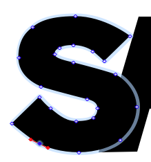
I spent by far the most time on the “S”. I didn’t like the original Arial S and wanted to replace it the most since it’s by far the most identifiable letter of the ones I used. Also it didn’t look blocky and aggressive enough in my opinion. There was quite a bit of variation in the width of stroke which I didn’t like, so I drew my own “S” over top of it with a more even stroke (drawn with beziers). I also didn’t like the flat ends so I switched over to ends on 45-degree angles. Getting it to balance was interesting … the bottom end of the S actually extends out beyond the curve above it, while the top end is shorter than the curve below it. Weird.
I actually tried out another one which was even more streamlined, with the top and bottom strokes ending totally horizontally (like in the Star Wars logo) but that looked too, I don’t know, sci-fi?
Finally I added the hole to the right of the X, before the I. And then I redrew the rest of the letters by hand so that they would all flow together. Now there’s no Arial Black left at all.
Oh yeah, and post-processing in Photoshop to give it that 3d look.