Scientific American infographics or chartjunk?
This data graphic isn’t just crazy, it’s misleading.
Enhanced information graphics are part Scientific American magazine’s refresh effort. They probably feel the pressure from Seed magazine’s great imagery. Right now they’re they’re just flailing around and showing how to do it wrong.
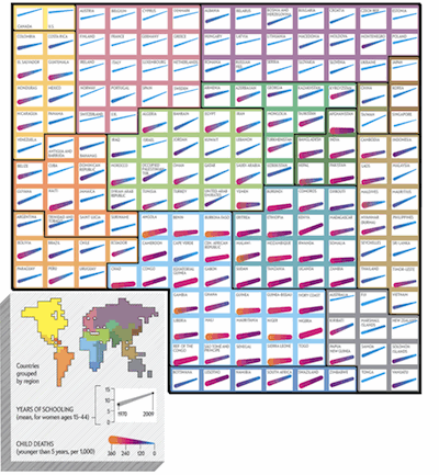
When I first looked “Baby’s Life, Mother’s Schooling” I thought it was a periodic table of the elements with psychedelic colours. My first intuition was the blue arrows would show the increase in child survival in each country as mother’s education grew. But the colour gradients and line thickness changes confused me.
So I read the accompanying text. It purports to explain:
"Mortality drops in proportion to the years of schooling that women attain â€_ as seen above in each rising line."
(this is wrong).
The legend clarifies what the colour gradients mean. It seems that the thickness and colour of each line shows the rate of infant mortality. The rising arrow, on the other hand, shows how much, between 1970 and 2009, education levels have gotten better for women. That’s not what was advertised.
I thought I was looking at improvements in child health, not improvements in parental schooling. Where’s the real data? Try to read the thickness of each line from left to right. It’s not easy to quantify the thickness change by eye, and yet this is the key chart data.
Examples:
- Things seem to be going well in Guyana. But in fact, the change in infant survival has been minimal. Line thickness stays the same.
- Yemen appears to be doing poorly, but in fact, infant survival got better, even as women's education stagnated, contradicting the central theme. Line thickness decreases, even though the angle is flat.
The irrelevant time data obscures the relevant correlation data. On the basis of this evidence, I claim that the chart is not only ugly but actually misleading.
In addition to these massive flaws there are also some only major flaws such as:
- The table of elements style obscures the geographic layout.
- The grid layout distorts actual continent shapes beyond identification.
- The colours surrounding each continent are unnecessary non-data ink and clash with the data colours.
- The extra world map in the legend adds to the confusion about geography.
- Since the arrows point up, the title should say that "child survival rates go up" rather than mortality going down.
That’s a load of complaining, and it would be inappropriate if I didn’t end by showing how to fix it. So. If I had been involved in the editorial design, I would have suggested that the artist replace the grid with a real world map, which can easily contain the data elements in free-form layout on top of the relevant country. Next, I would have made each arrow a mini-graph keyed to education in the X dimension and survival in the Y dimension. I would have calmed or eliminated the colouring, since it adds no information.
Multivariate charts are tough to implement, all infographic designers are aware of that. However, that’s no excuse. Scientific American should be a beacon of good data graphics, not a disseminator of chartjunk. They need to get their game in shape before they consider themselves serious purveyors of data visualizations.